
Tibber: Converting freemium users through value-led empty states
Project overview
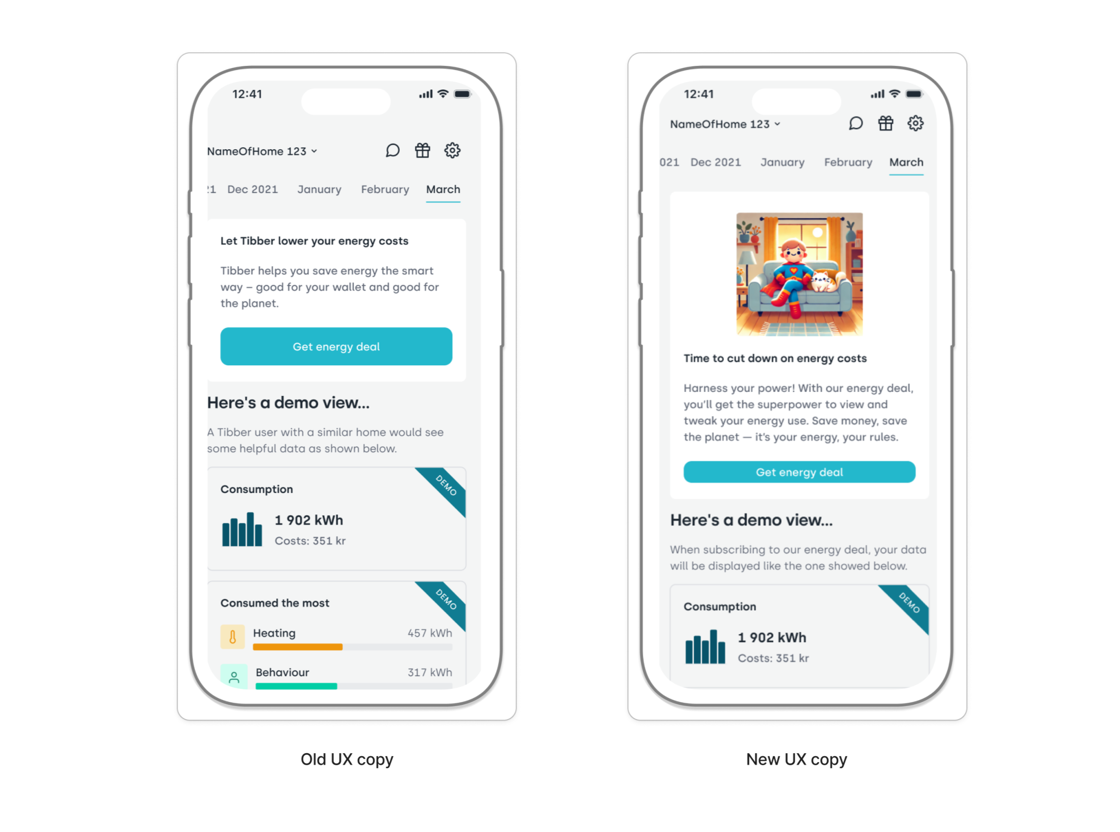
For this UX writing project, I redesigned the analysis tab empty state for Tibber, a leading green energy provider in Europe. The goal was to bridge the gap between freemium and premium users by showcasing the real-world utility of Tibber’s energy insights. My scope involved auditing the current no-data experience and creating a more engaging, persuasive entry point that encourages users to sign up for an energy deal.
Goals
The objective was to turn a passive, empty screen into a high-converting demo experience. I focused on three strategic pillars:
Show, don't just tell: Transitioning from static demo data to an interactive preview of premium value.
Brand-led persuasion: Integrating Tibber’s unique superhero brand voice to create a more memorable and less clinical utility experience.
Frictionless conversion: Using clear, benefit-focused CTAs that highlight the why behind the energy deal rather than just the what.
My process
User motivation & mining: I performed conversation mining via Trustpilot to identify the buzzwords and emotional drivers of Tibber’s most loyal customers.
Competitive audit: I reviewed high-performing empty state patterns from leading fintech and utility apps to understand how to handle missing data without losing user interest.
Voice & style alignment: I performed a deep dive into Tibber’s style guide and social media presence. I specifically chose to lean into their superhero metaphor to make energy management feel like a superpower rather than a chore.
AI-assisted ideation: I utilized AI as a brainstorming partner to iterate on header variations and generate UI concepts that moved beyond a simple text-and-button layout.
UI/UX logic shift: I decided to keep the demo view but redesigned the hero section of the tab to serve as a more compelling invitation to the premium experience.
Challenge
The primary hurdle was making an empty tab feel valuable. Most users drop off when they encounter a screen without their own personal data. I had to reframe the analysis tab (which normally feels broken without an active deal) into a coming attraction that highlights the specific financial and environmental benefits of upgrading. I needed to balance Tibber’s playful brand voice with the serious utility of energy tracking.
Results
While a spec project, the redesigned flow offers a strategic blueprint for increasing user retention and conversion.
Increased feature discovery: By making the demo data feel like a preview, users are more likely to explore the tab’s potential rather than bouncing.
Strengthened brand trust: The use of Tibber’s superhero voice creates a consistent, transparent, and friendly user experience even for non-paying customers.
Reduced user confusion: The benefit-led copy clearly explains why the tab is empty and exactly how an energy deal unlocks the full experience.
Next steps
CTA tracking: Implementing event tracking on the new “Unlock Insights” buttons to measure the click-through rate compared to the original version.
A/B testing: Running a split test between the original “No Data” view and the new “Interactive Demo” to see which drives more energy deal sign-ups.
Qualitative interviews: Testing the superhero-themed copy with freemium users to ensure the tone is perceived as empowering rather than gimmicky.
Accessibility audit: Reviewing the new UI elements and contrast ratios to ensure the analysis tab remains inclusive and readable for all users.